Amplify Your Arts Organization
Elevate your arts and cultural organization with Leap Patron Management! Built entirely on Salesforce, our complete solution harnesses the power of industry-leading CRM technology to capture more data on your patrons than ever before. With these insights, you’ll be empowered to sell more tickets, engage your donors, and cultivate a loyal community of members. With our full suite of relationship management tools, you’ll have everything you need for your organization to succeed!

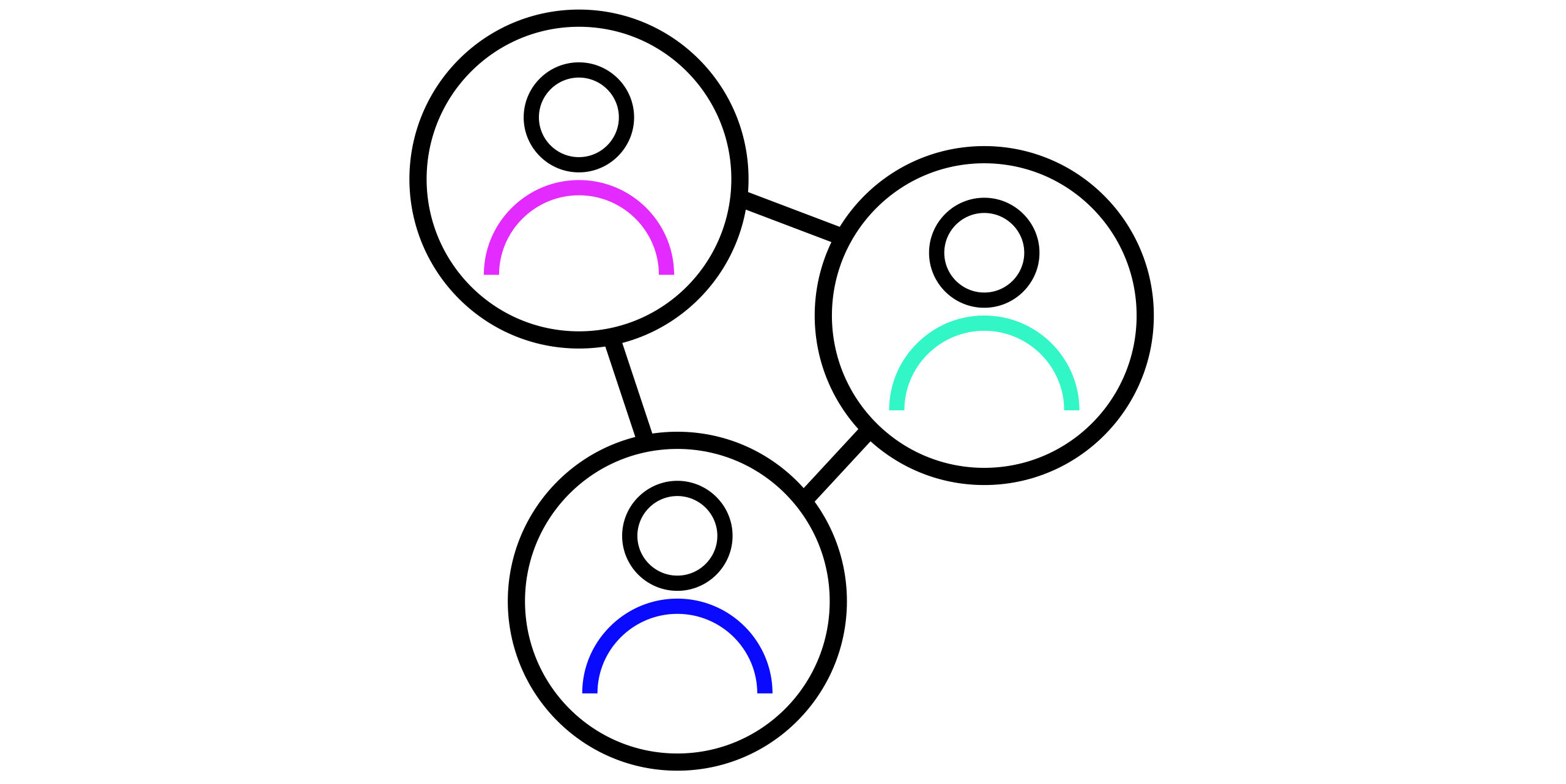
The Power of Patron Management
Strengthen Relationships
Use data capture to keep patrons connected with your organization, like sharing upcoming shows and exhibitions they’re sure to love.
Raise More Funds
Stay on track with your fundraising goals, hone your donor outreach strategy, and manage all your grants with ease.
Easy Access Anytime, Anywhere
Manage everything related to your organization – ticketing, fundraising, marketing, and more – from one convenient location.
Elevate Your Arts Organization Today

The Ultimate Solution for the Arts

Driving Your Organization Forward with Salesforce
Our solution’s CRM platform, PatronManager, is proudly built on Salesforce, the industry-leading CRM for over 150,000 of the world’s leading companies with customers making over 2.9 billion transactions per day. It’s 100% secure to store your patrons’ personal information, 100% cloud-based to handle all your data, and 100% mobile-friendly to let you access everything on the go. Update and search for patron information, view real-time dashboards, and check ticket sales and fundraising goals when you’re on the go.
Through the Salesforce AppExchange, you can also seamlessly integrate more than 2,000 apps from thousands of developers with more apps added every month. Thanks to our cutting-edge technology, Leap Patron Management has the only CRM you’ll ever need because it’s designed to grow with you for decades (yes, we said decades!).

"PatronManager is user-friendly, intuitive, and easy to train new users."
New York Live Arts
"PatronManager has made patron management and the ticketing process so much easier, both on our end and on the patron’s side as well."
Turtle Creek Chorale
"PatronManager changed the way we do business in our box office. I’m happy because I have a system that allows me to track everything, in just about any way I need to."
Adelphi University Performing Arts Center
Frequently Asked Questions
Does Leap Patron Management offer its own ticketing system, or would I use Ticketleap to sell my tickets?
Event organizers using Leap Patron Management will sell tickets through the Patron Management system itself, not through Ticketleap. That way, you can see the fullest picture of each patron’s relationship with your organization, including all of their ticket purchases, donations, communications, and more in the same place.
Does my organization have to have Salesforce to use Leap Patron Management?
The core of Leap Patron Management is PatronManager, a highly specialized and detailed CRM platform that sits on top of the Salesforce platform, so Salesforce is required. The good news is, when you become a Leap Patron Management customer, we will generate a Salesforce instance for you. That way, there’s no need to ever deal with two separate companies! Leap will help with implementation and ongoing support of your patron management system.
How much does it cost?
The majority of Leap Patron Management clients are nonprofits, so we know that organizations need flexibility when it comes to expenditures. We can offer many kinds of contract structures to fit your needs and budget. From there, we will work with you to create a custom proposal based on your organization’s specific circumstances.
Do I have to charge ticket fees?
Not necessarily! Talk to a Leap Patron Management specialist today to learn more about the various ways we can structure a contract.
What email marketing systems work with Leap Patron Management?
Leap Patron Management has a two-way integration with MailChimp, Emma, and Campaign Monitor. Choose whichever works best for your organization, then watch the data automatically flow back and forth into your database!
How long does it take to set up our arts management system?
Implementing Leap Patron Management can vary in length depending on the organization, but a typical timeframe is between three and four months. Our implementation specialists will manage the setup and data migration process, helping you every step of the way to make sure that your patron management system is set up for success!
What types of hardware are compatible with Leap Patron Management?
Our team at Leap will help you procure the right hardware for your organization's needs when it comes to ticket printing, processing credit card transactions, and more. For ticket printing specifically, our preferred vendor is Boca Systems. Please get in touch with our team if you have specific hardware questions!